Cut Support Requests in Half by Optimizing Navigation in Your SaaS App
An increased amount of support requests, especially repeating ones, is a big warning sign that you need to pay attention to your UI/UX. I’ve seen this too many times as a UI/UX consultant working with SaaS founders for years.
Common support requests look like this: “I wasn’t able to find X. How can I do Y?” The majority of these problems can be solved by optimizing navigation — the most important piece of functionality in your web app. In this article I’ll show you a few easy steps which will help you cut support requests in half.
Understand the Importance of Navigation
Have you ever gone back to a book you’ve read, searching for a certain fragment? In some books, I bet you discovered that chapter names don’t tell you a thing. These fancy titles look great in context, they’re stirring and poetical, but do they tell you exactly what the chapter is about?
Your web app is a similar thing. Whenever the user drills one level deep from your fancy homepage or dashboard, they won’t see anything but that tiny bar on top of the screen. So you want to make it as simple and informative as possible.
Step 1. Focus on Objects, Not Actions
In my book, The UI Audit, we don’t tackle any design activities without writing down the product strategy. You need to answer the following questions:
- Audience: who are your ideal users?
- Goal: what big goal do they have in mind when they sign up?
- Tasks: what tasks do they perform daily when they log into your web app?
- Objects: what items do the users handle while performing these tasks?
If you’re interested in more details, download the free chapter on product strategy with worksheets here.
In this product strategy, we’re going to focus on tasks and objects today. But navigation isn’t just a pile of them.
We’re all taught that everything should be action-driven: links should always be verbs, everything should have a strong call to action, etc. The natural urge is to build your navigation around actions. But don’t do that — that’s number one mistake I find in too many web apps.
Let me explain why. Here’s a very intimidating picture:
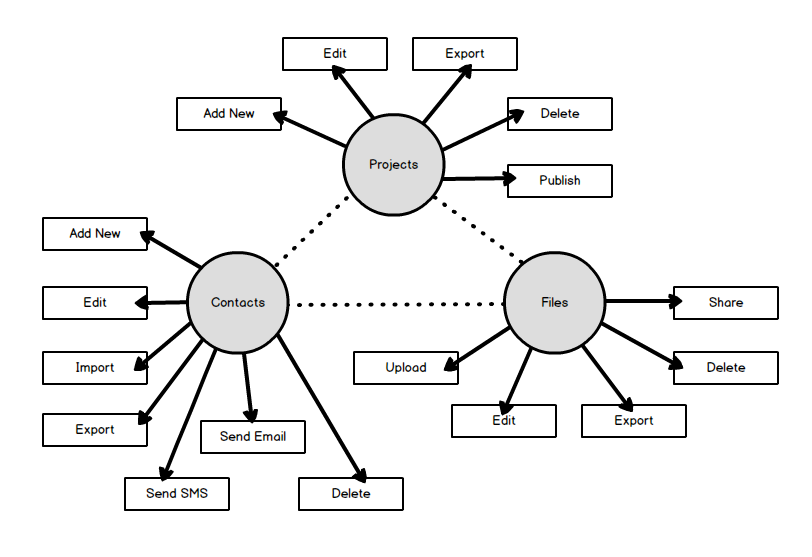
It looks overwhelming, but actually represents a very simple web app. There are just three types of objects (projects, contacts, and files). But look how many actions can be performed within each single object! Adding, editing, deleting, exporting, sharing, and a ton of other options. If we try to include all these actions in the navigation, it will result in a huge mess.
Instead, your navigation’s primary goal should be telling the user where all their things live — so that they can confidently navigate to these locations and perform all relevant actions there.
So for this case, the ideal navigation should look like this: Projects, Contacts, Files. Unless it’s a more complex system where files can only exist inside projects. Then the navigation will be even shorter: Projects, Contacts.
Typically, objects in your navigation are represented by nouns. But sometimes verbs are also necessary. Discover is a perfect label for videos just like mine, but created by other people (can’t think of any possible noun meaning the same thing). Manage is a perfect label for a dropdown menu with multiple object types which don’t have anything else in common.
It’s also very important to use the real-life language of your users. You can collect actual terms by doing “sales safari” — researching forums and other places where your users hang out online. Unlike the original sales safari, where the point of research is finding user pains, this time you’ll be looking for terms they use to describe their knowledge domain.
Step 2. Promote Key Tasks
Let’s go back to your product strategy. What key tasks does the user perform daily when they log into your web app? List these tasks, and make sure they’re accessible from the first level of your navigation.
Here’s a good example. Some users rely on a calendar heavily in their workflow. So it would be a big mistake to tuck Calendar in a dropdown menu with “odds and ends” (where I often find it auditing web apps).
Sometimes we’re dealing with “forgotten functionality” — features that are important and helpful, but somehow neglected by the users. You can easily promote these features by including them into the first level of navigation.
It’s even acceptable to include an action in your navigation if it’s really important! But put it in the end, after the objects — the order of the elements matters here. Users perceive the first item as the most important, others have decreasing value, but the last item is also critical. So the perfect place to promote an important action would be in the end of your navigation list.
Step 3. Avoid Common Mistakes
Be careful with icons. They have less meaning than you think! Only a limited number of icons convey a simple, obvious message (think of a trash can for delete or a gear for settings). Others can be downright confusing! It’s better if you include text labels, but then icons become mere decorations. I know you think they add visual interest — but in long lists they add visual noise instead.
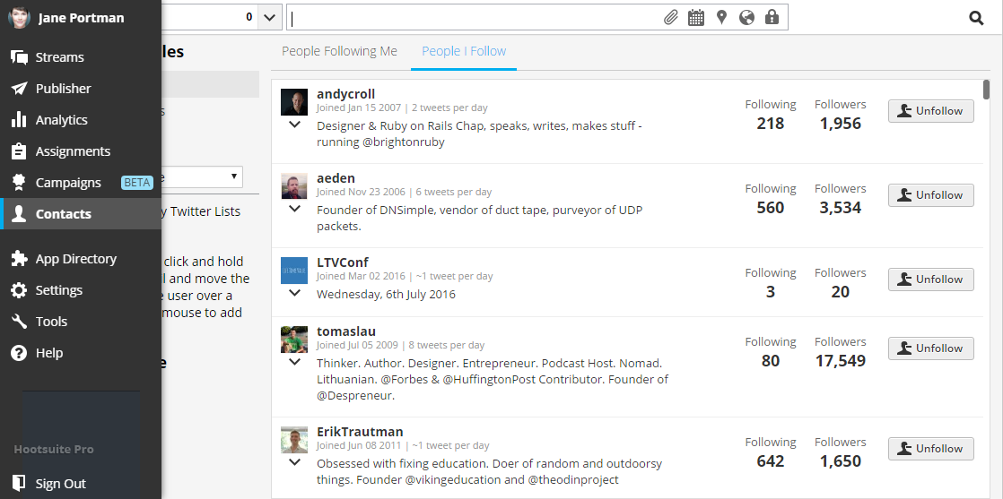
Look at this screenshot of HootSuite (great app for social media marketing).
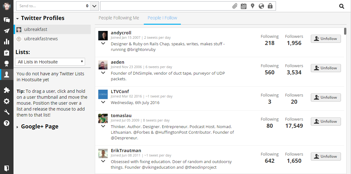
Can you easily tell what icons on the left mean? Can you predict the difference between the message icon and the paper plane? Can you tell what that piece of puzzle means?
I’m quite sure the guys at HootSuite are aware of this problem, too. So they show text labels on mouse hover. But it’s definitely not the best idea to rely on hover effects for your main navigation!
Be careful with your dashboard. It’s merely a welcome mat, and it disappears as soon as the user starts working. So don’t rely on it as an important way of navigating around.
Dashboards are a blessing and a curse of modern web applications. Here’s what a typical admin theme looks like:
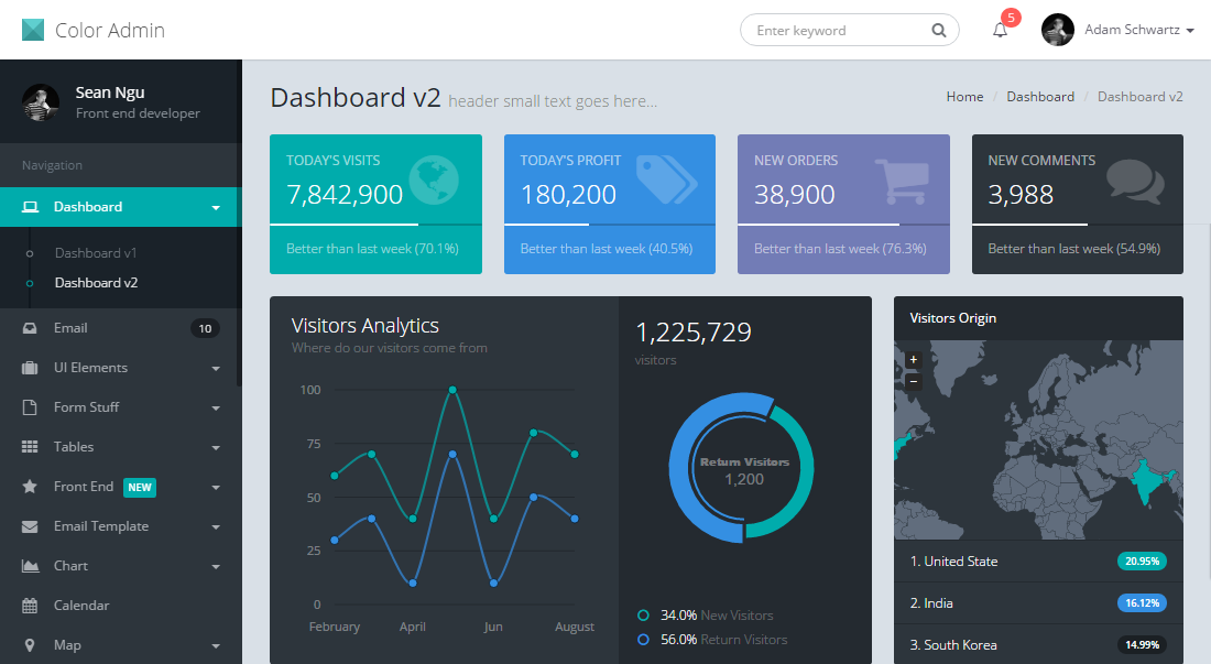
The tragedy is, normal hardworking web apps usually don’t need a wide range of cool graphs (unless your users are monitoring a server farm). Founders actually struggle to find suitable information to fill in their fancy dashboards! Including navigation elements is one of the most popular mistakes.
Be wiser — if you don’t know what to put on your dashboard, omit it entirely! Just show the user their most important working environment immediately. What if Gmail displayed a beautiful dashboard with stats instead of your inbox?
Be careful with “Quick Add” functionality. I’ve seen this multiple times in CRM systems. The user can “quick add” something from their main navigation (usually it’s adding a new client). But then they encounter a huge problem: “Now that I added X, where did it go?”
Ideally, you should train your users to do these tasks from dedicated areas of the app. Make the Add New Client button big and prominent in their Clients list, not in their main navigation.
Final Words of Encouragement
These simple principles should provide a whole new mindset for you. But they don’t mean a thing unless you put them in action.
Don’t wait until tomorrow! It never hurts to go back to the basics and revise UI/UX in your web app. Your users will be grateful, and your support team will be relieved!
About the Author
Jane is an independent UI/UX consultant who helps SaaS founders build focused, profitable products. She enjoys writing and speaking at events, but most of all she likes to solve real-life business problems with smart UI design. Check out her latest book, The UI Audit, or get Jane’s free course on web app optimization.
When users cannot find features in your app, they submit support requests asking 'How do I do X?' Fixing your navigation so things are easy to find eliminates these tickets at the source, often cutting request volume significantly.
Use nouns (objects) like Projects, Contacts, and Files. Actions like Add, Edit, and Delete should live within each object's page, not in the main navigation. Object-based navigation tells users where their things live.
Audit your app's navigation and UX to address the root cause of common questions. Use clear text labels instead of ambiguous icons, promote frequently used features to the top level, and skip the dashboard if it does not serve a clear purpose.